
Plan Subscriptions
The majority of Powerley’s cost revenue comes from hardware and SaaS (which requires an Energy Bridge hub in the home). In an effort to legitimize our product in the Home Energy Management, Energy Efficiency and Demand-Side Management industries, we needed to increase Online & Bound (connected to a home’s Wi-Fi and smart meter) hubs in the field by almost 100% over just 4 short months.
After evaluating the impact of the pay model on the Energy Bridge hub request rates of our largest commercialized customer, we found that simplifying the process and offering users a more seamless upgrade & downgrade experience began to increase hub request rates. These updates are intended to have continuous positive impact on conversion and churn – two primary KPIs.
My Roles
Strategic Direction
Creative Direction
User Research
User Testing
Product Design
User Experience Design
Cross-functional teams
Product Design
Product Management
Voice of the Customer
Engineering (Mobile & Web)
Data Science
Quality Assurance
External Research Consultants
The Problem
Users are not upgrading their plan
Users that had requested a hub and were rejected are still being billed
Users on an upgraded plan are choosing to downgrade
Users are falling off on plan confirmation pages
Hypothesis
Users don't understand the value of the app or hub, therefore can’t justify the cost of upgrading
Throughout each channel, we lack proper photography of hardware in environmental situations
Users are unfamiliar with the hardware needed to upgrade
Users are confused by the differences between plans
Users are unaware of the free trial
Users see their info is pre-populated and don’t see that they need to confirm
The process to upgrade is too complex
There’s a lack of overall support, especially in the downgrade experience
Technical performance issues
Once sorted out, rates of our other commercialized customers will increase as well
The Goals
Us: Offer better upsells, support and clarity to increase conversion
User: Gain access to energy saving insights in order to save on their monthly utility bill
Utility: Increase number of Energy Bridge hubs in the field
Success Metrics
Increase Energy Bridge hub request rate
Reduce monthly churn rate
Challenges
A few challenges came up during this project because this redesign is only being rolled to iOS (due to team bandwidth) in the short-term, inconsistent platform parity between iOS and Android would potentially impact marketing and customer support efforts. Users may realize the visual differences in promotional campaigns and be confused or upset. On top of that, both platforms are leveraging the same areas of the backend for different elements and needed to be heavily tested during QA to ensure proper alignment.
Approach
This redesign was part of a company-wide initiative to drop everything on the roadmap and work together to quickly increase conversion rates. During this time, we were able to utilize top talent from across the company to work on solving problems and creating a better upgrade & downgrade experience for the user.
Internal Research
After looking at current fallout point data, we identified that there was an 83% fallout between starting population and upgrade, significantly impacting conversion rates. We validated this fallout data with existing customer reviews. Due to these fallouts, we saw the average weekly request rates drop 76% over the course of almost one year.
Discovery
Collecting and analyzing competitive data allowed us to make more informed decisions for the redesign. We evaluated visual design language, UX copywriting, content, and timing of marketplace products that have high ratings & a large user base.
Inspiration from successful companies like Spotify, Strava, Lifesum, Headspace and Duolingo led our direction.
We researched SaaS best practices and took them into consideration to structure a streamlined flow – hammering further simplicity with the reminder that "you don’t need more space, you need less stuff."
Testing
Utilities recruited customers for us to conduct on-the-ground user research to validate causation.
VOC Surveys, Behavioral Analytics, and A/B tests were performed and evaluated.
Ideal User Flow
After mapping out our current flow from post-login to Subscriptions, we found that we were not only lacking in pathways to Upgrade, but hadn’t considered all potential edge cases. We worked towards several ideal user flows and came up with one that checked all of the boxes–offering more routes to the end goal, and a business-driven exit ramp that still remains user-centric.
Solution
As part of the effort to holistically improve the Customer Journey experience, we integrated a smoother user-centric path to the Subscriptions flow (both upgrade & downgrade).
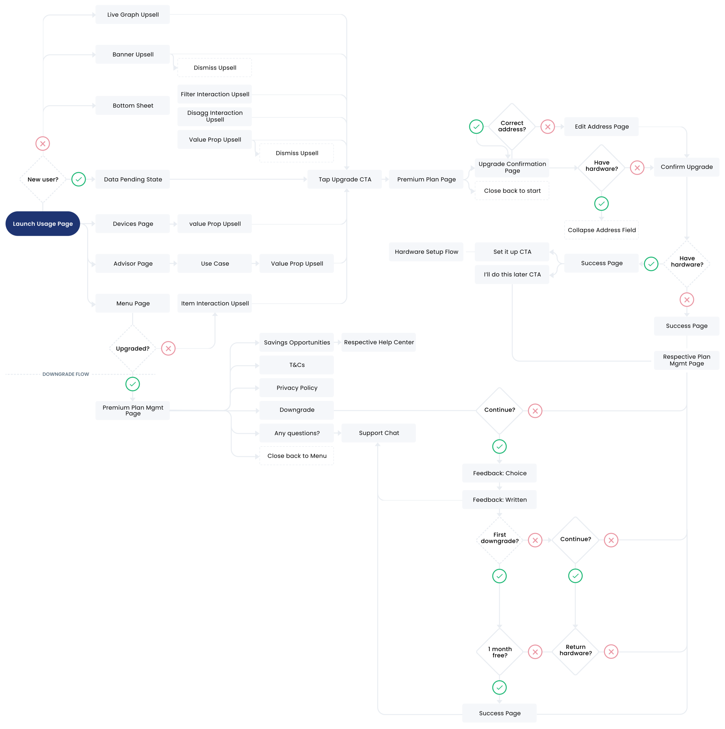
Additional Upsells
After analyzing the most-used pathways to the upgrade flow, we found that the main 3 routes came from upsells on our Usage page, My Devices page and the Menu page (where Subscriptions live). As these have proven to be useful entryways to Premium, we aim to have a small reminder to upgrade on every page.
It’s clear that users will pay for a little convenience. This means that in order to increase engagement, the benefits of the Premium plan needs to be extremely clear right off the bat.
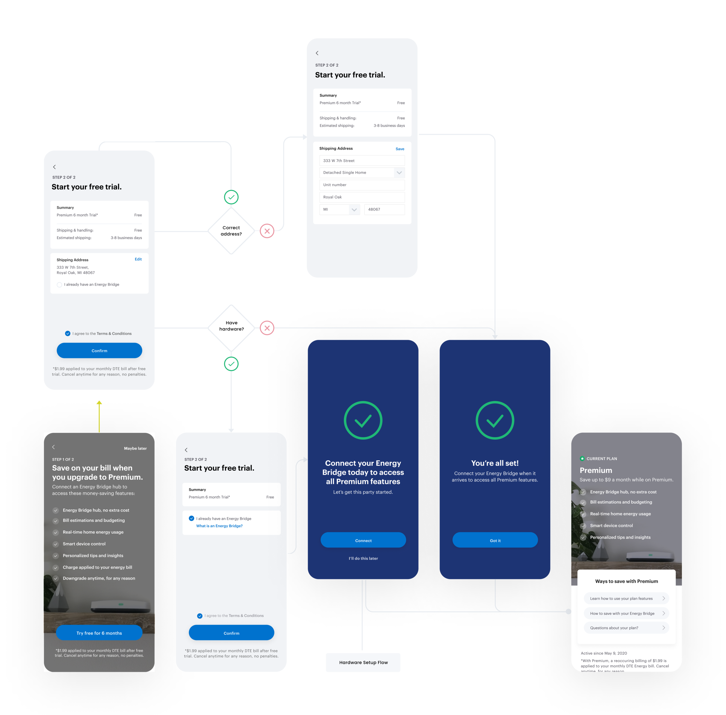
We offer an upsell in the Onboarding flow that displays clear value props alongside an actionable CTA–if the user declines, they will see continuous soft-sells throughout the experience (most dismissible). These soft sells are well-timed (triggered by user behavior) and strategically placed, so they become persuasive to those ready to upgrade, and unobtrusive to those who aren't.
The majority of soft-sells reach the user only when the content will add value to their experience. Messaging shifts from general value props to tangible use cases, pushing for deeper user personalization, and helping familiarize features by showing a glimpse of functionality.
On the Usage (landing) Page, if the user hasn’t scrolled to where UI-related soft sells may be hidden after two visits, a notification banner upsell will display .
Redesigned Upgrade Flow
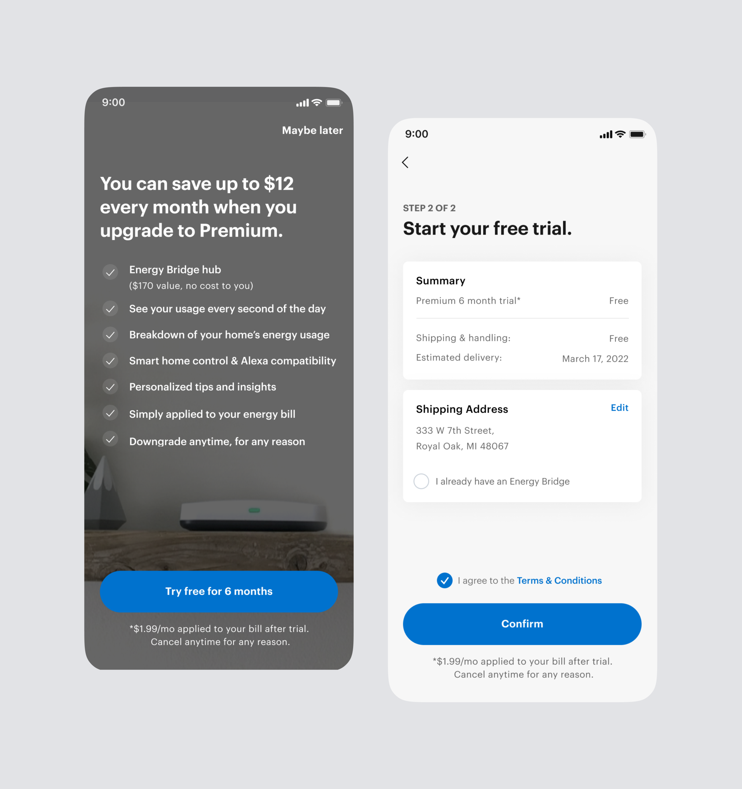
Plan names had previously been Lite, Live, & Link, reflecting the base plan, the plan to connect an Energy Bridge hub, and the plan with smart home capabilities. This was an obscure naming system, but we were able to persuade stakeholders to get behind more recognizable terminology. Plans have been simplified to Basic & Premium, alleviating the user from avoidable confusion.
We removed the ability to choose between multiple plans.–now the terms ‘Upgrade to Premium’ and ‘Downgrade’, are used in place of displaying additional plan options.
The Address Confirmation page being its own step in the flow was previously responsible for 5% of authentication fallout. We removed this page and now pre-populate user’s address on the Confirmation page, allowing them to move on without second guessing, but edit if needed.
Messaging and iconography in plan descriptions were simplified, and CTAs now infer little work is required of the user. We figure that if someone needs to click around, or needs some kind of dictionary to understand what’s being shown, we’ve already lost them.
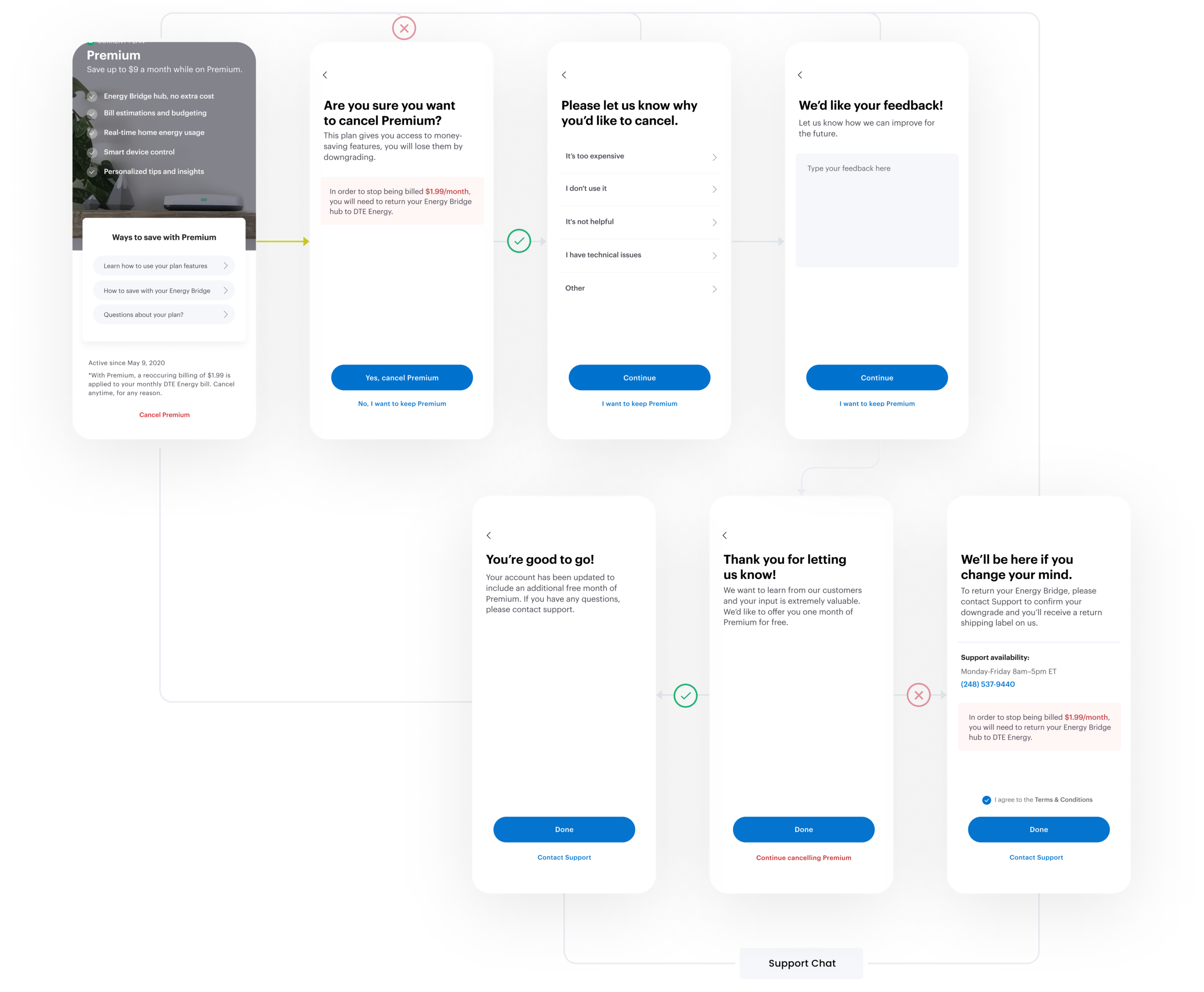
Redesigned Downgrade Flow
We added several steps to our cancellation flow, to provide a more interactive concierge experience. Since the flow has been elongated, there is a clear option to cancel in each step as to not upset an already out-the-door user.
We’ve added continued learning, live support, and retention offers to provide relevant information in hopes we can help solve the issue prior to cancellation.
Copy was carefully thought out, wanting to show value of the product while still respecting the user. We also let them know that they are free to re-subscribe at any time.
Technical improvements and additional error states
Users can be rejected from getting a hub for various reasons. For the past few years, we never notified them of their rejection, an experience that left our users in the dark.
Now, once the user has hit confirm, a dialog is displayed, informing them of their rejection and potential next steps to take.
Marketing
Utilities contribute to relevant promotions such as social advertising, customer emails, and App Store/Google Play designs are all updated to reflect the new ‘Upgrade to Premium’ model.
Results
Similar to the Customer Journey flow, this product was only deployed on iOS. After one month, request rates increased by 25%, which represents a large expected net impact in Hardware/Software revenue over the next year.
In addition, iOS had been traditionally lower performing than Android with respect to conversion rates. Of the 73 weeks from January 2019 to May 2020 (just before launch), iOS only led in request rates 27% of the time, with only one instance of two consecutive weeks. Post-launch, iOS has had a higher request rate than Android for all 4 weeks.
Next steps
Roll out to Android. The impact to iOS is evidence that the new upgrade flow has an improvement on conversions and although the population of Android users is less, the total net impact to Android over one year can be expected to be more than that of iOS, justifying the effort.
Evaluate and finesse the upsells & soft-sells we decide to display
Gather user feedback on the experience and make necessary updates